

3 Paths to a Working Marketing Analytics Dashboard for CMOs & Teams
A marketing analytics dashboard is a visual workspace that pulls your campaign, web, and revenue data into one view so you can track performance and make decisions without digging through five different platforms. This guide gives you role-based templates for CMOs, managers, and specialists, a KPI checklist that maps metrics to actual decisions, and three setup paths so you can have a working dashboard running this quarter.
TL;DR:
- High-level dashboards like those for CMOs should prioritize ROI, total revenue, and pipeline value, while operational dashboards focus on cost per lead and conversion rates.
- Effective setups limit KPIs to 8-12, always include targets or prior-period comparisons, and assign ownership to maintain clarity and accuracy.
- Building a dashboard involves choosing the right data sources and connectors, with options ranging from quick prebuilt tools to enterprise data warehouses.
- Using the correct attribution model, such as data-driven attribution, requires comparing multiple models to prevent misleading insights about channel performance.
- Clear governance, defined metrics, and discipline in reporting practices are more critical for trust and usability than the choice of dashboard template or visualization tools.
Table of Contents
- Which dashboard fits your role: executive, manager, or specialist
- Which KPIs actually belong on your dashboard
- Ready-to-use dashboard templates for common marketing goals
- How to build a unified dashboard in three practical ways
- Choosing an attribution model without misleading yourself
- Dashboard design rules that keep reports actionable
- Picking tools and visualizations that match your team’s size
- Finishing the build: checklist and handoff plan
- How we approach measurement at Xpert Marketing
- The template you choose matters less than the discipline behind it
- Get a working dashboard without building it yourself
- Sources
- FAQ
Which dashboard fits your role: executive, manager, or specialist
Not every dashboard should look the same, because not every reader needs the same decision. A CMO scanning numbers before a board meeting needs a different view than a paid media specialist adjusting bids at 9 a.m. Building one dashboard for everyone usually means building one that satisfies no one.
Executive or CMO dashboards answer a single question: is the business getting a return on marketing spend, and where should the budget move next quarter. These views stay high-level, often a single screen, and connect marketing activity directly to revenue.
Manager dashboards sit one layer down. A campaign manager or channel lead needs to see which campaigns are pulling their weight and which need a budget cut this week, not just a quarterly trend line.
Specialist dashboards go deepest. An SEO analyst, paid search buyer, or email marketer needs granular, channel-specific detail: keyword position changes, bid adjustments, subject line performance.
- Executive dashboards track ROI, total revenue, and LTV:CAC, refreshed regularly and often shared as a single-screen view or PDF snapshot before leadership meetings.
- Manager dashboards track cost per lead, conversion rate by channel, and pacing against budget, typically checked daily with a live link the team can revisit anytime.
- Specialist dashboards track click-through rate, keyword rank, email open rate, and cost per click, often monitored in near real time during active campaigns.
Executive-tier views prioritize ROI, total revenue, and LTV:CAC while operational dashboards drill into channel-specific conversion rates and cost per lead, a split that keeps each audience looking at numbers they can actually act on. Cadence matters as much as content: a CMO reviewing a live dashboard daily will drown in noise, while a specialist checking a weekly PDF will miss the moment to fix an underperforming ad set.
Which KPIs actually belong on your dashboard
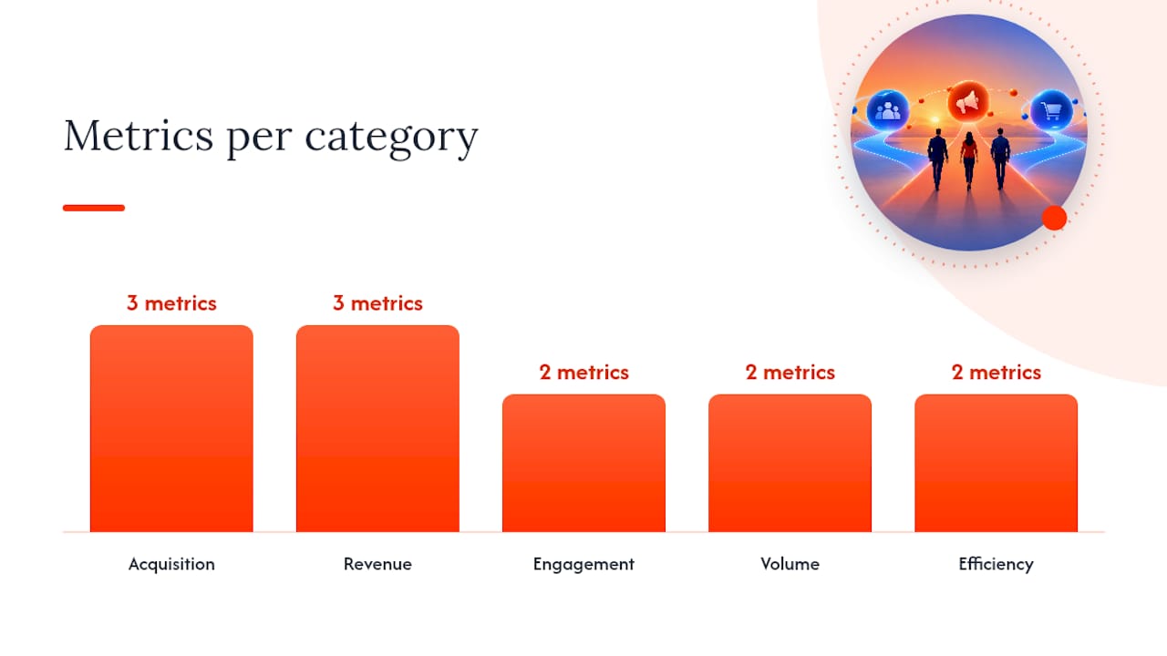
Before you pick a single chart, pick your metrics, because a dashboard built around the wrong numbers will mislead you no matter how clean the design looks. Group your KPIs into five categories and pull 8 to 12 total, never more, so the view stays readable at a glance.
The five categories worth building around are acquisition, revenue, engagement, volume, and efficiency. Acquisition metrics tell you how people are finding you. Revenue metrics tell you whether that traffic is worth anything. Engagement and volume tell you about the health of the funnel in between, and efficiency metrics tell you whether you are spending well.
- Acquisition: customer acquisition cost (CAC), sessions, and cost per click (CPC).
- Revenue: return on ad spend (ROAS), return on investment (ROI), and customer lifetime value (CLTV).
- Engagement: click-through rate (CTR) and average session duration.
- Volume: conversions and total leads generated.
- Efficiency: conversion rate and cost per lead.
Core metrics worth tracking almost everywhere include CAC, CLTV, ROI, ROAS, and conversion rate, a set that covers spend, return, and funnel health without requiring a dozen extra charts to interpret them correctly.
E-commerce and lead generation businesses should weight these categories differently. An e-commerce dashboard leans harder on ROAS and average order value because revenue is transactional and immediate. A lead-gen dashboard leans on cost per lead and lead-to-close rate, since the sale happens well after the marketing touchpoint. Both benefit from per-channel breakdowns, but only when you have enough volume in each channel to make the comparison meaningful. A channel bringing in ten leads a month does not need its own row.
Effective dashboards organize metrics into acquisition, revenue, engagement, and efficiency categories, with each metric shown alongside a target or prior-period comparison so a number on its own never has to speak for itself.
Ready-to-use dashboard templates for common marketing goals
A template is only useful if you can copy the structure and swap in your own numbers. Each of the following has the same format: purpose, headline metrics, recommended widgets, and who should be looking at it.
- CMO executive overview. Purpose: a single-screen snapshot of marketing’s contribution to revenue. Metrics: total revenue, ROI, ROAS, LTV:CAC, CAC, and pipeline value. Widgets: scorecards up top, a revenue trend line, and a channel contribution bar chart. Audience: CMO and leadership team, reviewed weekly.
- Web analytics dashboard. Purpose: track site health and traffic quality. Metrics: sessions, users, bounce rate, average session duration, conversion rate, and top landing pages. Widgets: trend line for sessions, a funnel chart for conversion steps, a table of top pages. Audience: web and content managers, checked weekly.
- Paid media dashboard. Purpose: monitor spend efficiency across ad platforms. Metrics: CPC, CTR, ROAS, cost per conversion, impressions, and spend pacing. Widgets: scorecards for spend versus budget, a trend line for ROAS, a table broken out by campaign. Audience: paid media specialists, checked daily.
- Social media dashboard. Purpose: measure content reach and engagement. Metrics: follower growth, engagement rate, CTR, impressions, and referral traffic to site. Widgets: trend lines for growth and engagement, a table of top-performing posts. Audience: social media managers, checked weekly.
- Email marketing dashboard. Purpose: track list health and campaign performance. Metrics: open rate, CTR, unsubscribe rate, conversion rate, and revenue per email. Widgets: scorecards for the current campaign, a trend line across sends, a table comparing subject lines. Audience: email specialists, checked per send.
- SEO dashboard. Purpose: monitor organic visibility and traffic quality. Metrics: organic sessions, keyword rankings, click-through rate from search, backlinks, and top landing pages. Widgets: trend line for organic sessions, a table of keyword movement, a scorecard for domain visibility. Audience: SEO specialists, checked weekly.
- Attribution and conversion path dashboard. Purpose: understand which touchpoints drive conversions. Metrics: assisted conversions, days to conversion, model comparison deltas, and top conversion paths. Widgets: a Sankey diagram for paths, a table for assisted conversions, a model comparison chart. Audience: analytics leads and channel managers, checked monthly.
- Lead generation dashboard. Purpose: track lead volume and quality through the funnel. Metrics: total leads, cost per lead, lead-to-opportunity rate, lead-to-close rate, and average deal size. Widgets: a funnel chart from lead to close, a trend line for cost per lead, a table by lead source. Audience: marketing and sales managers, checked weekly.
Each of these adapts easily once you know your business model. An e-commerce team swaps lead-to-close metrics for cart abandonment rate and average order value. A B2B lead-gen team adds a sales cycle length metric and ties the dashboard directly into CRM stages so marketing and sales are reading the same numbers. A subscription business adds churn and renewal rate to the revenue category, since a single conversion event tells you less than it would for a one-time purchase.
The single-screen executive view and the campaign-level operational view rarely need to be the same document. Give the CMO one page. Give the campaign manager a page per channel, and let the specialist go one layer deeper still with platform-native reporting feeding into the shared dashboard for consistency.
How to build a unified dashboard in three practical ways
Most marketing teams pull data from the same handful of sources: GA4 for web behavior, Google Ads and Meta Ads for paid spend, Search Console for organic search, and a CRM for what happens after the lead converts. Call tracking and offline sales data round this out for businesses with a phone-heavy or in-person sales process. Getting these into one place is the real work of building a dashboard, and there are three common paths depending on your time, budget, and technical resources.
- Quick connectors or dashboard products. Prebuilt tools connect GA4, Google Ads, and Meta Ads with a few clicks and require no technical setup. This is the fastest path, often live within minutes, and works well for small teams or a first dashboard you want running today.
- Looker Studio plus connectors. Google’s free tool paired with paid data connectors gives you far more control over layout, calculated fields, and blended data sources. Expect a setup of a few hours rather than minutes, with more flexibility to customize views by role.
- Data warehouse plus BI tool. Routing raw data into a warehouse and connecting a BI tool like Tableau, Power BI, or Looker gives you full control over data modeling and governance. This path takes real setup time, typically days to weeks, and makes the most sense for enterprise teams with dedicated data resources.
Combining GA4, Google Ads, and Meta Ads can be done in minutes with a connector product, in a few hours with Looker Studio, or over days to weeks with a warehouse and BI setup, and the right choice depends on how much customization and governance your team actually needs versus how fast you need something live.
Before you connect anything, run through a short checklist so the dashboard does not fall apart the first time someone questions a number.
- Confirm authentication and access permissions are set for every connected account.
- Map each metric name consistently across platforms so “conversions” means the same thing everywhere.
- Agree on naming conventions for campaigns and channels before data starts flowing in.
- Align time zones and attribution windows across every connected source.
Choosing an attribution model without misleading yourself
Attribution decides which touchpoint gets credit for a conversion, and the model you choose changes your reported cost per acquisition and ROAS without changing a single dollar of actual spend. Last-click attribution gives full credit to the final touchpoint before conversion. It is simple to read but tends to overvalue bottom-funnel channels like branded search or retargeting. Data-driven attribution distributes credit across the touchpoints in a customer’s path based on their actual contribution to the conversion, which usually gives a fairer picture for businesses with longer or multi-channel journeys.
Google’s attribution reporting supports multiple models including data-driven attribution, which assigns credit across the full customer journey rather than crediting a single touchpoint. Include a model comparison snapshot in your dashboard so stakeholders can see how CPA and ROAS shift depending on which model is applied, rather than presenting one model’s numbers as the only truth.
- Show assisted conversions alongside last-click conversions so upper-funnel channels get visible credit.
- Track days to conversion to understand how long your typical customer journey runs.
- Use a conversion path visualization, such as a Sankey diagram, to show common sequences of touchpoints.
Pro Tip: Run last-click and data-driven side by side for one full reporting cycle before switching models entirely, so you can see exactly which channels gain or lose credit.
Dashboard design rules that keep reports actionable
A dashboard fails long before the data is wrong. It fails when there are too many metrics, no context for what a number should be, or numbers that look impressive but tell you nothing about the business. Fixing this is more about discipline than design software.
Keep each view to 8 to 12 metrics and no more. Every metric should show its target and its prior-period comparison, because a number without a benchmark tells the viewer nothing about whether it is good or bad. Cut vanity metrics like raw impressions or total followers unless they connect to a real decision your team makes.
- Limit each dashboard view to 8 to 12 metrics so it stays readable in one glance.
- Always pair a metric with a target, a prior-period comparison, or both.
- Assign one owner per dashboard who is responsible for keeping definitions and connections current.
- Set threshold alerts on key metrics so a problem surfaces before the weekly review.
Effective dashboards show targets and benchmarks alongside raw numbers, which is the difference between a report that informs a decision and one that just displays activity.
Governance matters as much as layout. Agree on a single source of truth for each metric definition, document naming conventions so “leads” means the same thing across every team’s dashboard, and put a review cadence in place so stale connections or outdated targets get caught. Automation helps here: threshold alerts and basic anomaly detection can flag a sudden CPA spike before it costs a week of wasted spend, especially when those alerts are tied to a specific owner’s task list rather than sitting unread in an inbox.
Keep Goodhart’s Law in mind: when a measure becomes a target, it can stop being a useful indicator, so favor outcome-based measures tied to financial impact over easy-to-game proxies like raw click volume.
Picking tools and visualizations that match your team’s size
The right stack depends less on ambition and more on how many hands you have to maintain it. A two-person marketing team building an enterprise data warehouse is solving a problem it does not have yet, and a fifty-person team relying on a single spreadsheet is underserving the one it does.
- Small teams do well with a connector product or Looker Studio plus free connectors, since setup is fast and maintenance stays low.
- Mid-size teams benefit from a paid connector paired with Looker Studio or a basic BI tool, giving more interactivity without heavy engineering support.
- Enterprise teams should look at a data warehouse feeding a BI tool such as Tableau, Power BI, or Looker, where governance and modeling flexibility matter more than setup speed.
Visualization choice should match the question being asked. Scorecards work for a single number against a target. Trend lines show direction over time. Funnel charts show where volume drops between stages, and a Sankey diagram is the clearest way to show conversion paths across multiple touchpoints. Tables still earn their place for anything granular, like a full breakdown of assisted conversions by channel, where a chart would just compress the detail you actually need.
Finishing the build: checklist and handoff plan
A dashboard is not done when the charts render. It is done when someone besides you can open it, understand it, and act on what they see without asking you to explain it first.
- Confirm every data connection is authenticated and refreshing on schedule.
- Write a one-line definition for every metric on the dashboard.
- Set a target and a comparison period for each headline metric.
- Add annotations for major campaign changes or budget shifts so spikes and dips have context.
- Assign an owner responsible for maintaining the dashboard.
- Decide on a review cadence, weekly for operational views and monthly for executive summaries.
Sharing matters as much as building. A live link works well for teams that check dashboards often, while a scheduled PDF export suits executives who want a snapshot in their inbox each Monday. Slide exports still have a place for board meetings, where a single takeaway chart says more than a full interactive view. Set access permissions before you share anything broadly, and pair the dashboard with a short one-pager summarizing the headline numbers, since not every stakeholder wants to open the tool itself.
How we approach measurement at Xpert Marketing
We build dashboards around a three-part framework: measurement, strategy, and proof, which keeps reporting tied to decisions rather than just activity. Measurement establishes what is actually happening, strategy translates that into a plan, and proof ties the results back to financial outcomes leadership can act on. Our portfolio includes engagements where dashboard insight directly shaped a client’s next quarter of budget allocation, and our analytics work applies this same framework across the accounts we manage.
The template you choose matters less than the discipline behind it
Most advice on marketing dashboards focuses on which tool to buy, and that is the wrong starting point. The real failure mode is not a missing connector, it is a dashboard nobody trusts because two departments define “leads” differently, or because the CMO version has forty metrics competing for attention. Templates solve a formatting problem. Governance solves the trust problem, and trust is what actually gets a dashboard used.
If you take one thing from this guide, prioritize the KPI checklist and the ownership rule before you touch a single visualization. A polished dashboard built on undefined metrics will get abandoned within a quarter, while a plain table with clear definitions and a single owner will outlast it. Start with the fast connector path if you need something running this week, but budget time to migrate toward Looker Studio or a warehouse setup once your reporting needs outgrow a one-click tool. Speed and rigor are not opposites here, they are just sequenced differently than most guides suggest.
— Xpert
Get a working dashboard without building it yourself
Building the dashboard is only half the job. Someone still has to define the metrics correctly, connect the right sources, and keep the whole thing accurate as campaigns and platforms change. Xpert Marketing handles that end to end as part of Data & Analytics, alongside the strategy and execution work that feeds the numbers in the first place.
- Dashboard builds and audits across GA4, paid media platforms, and CRM data.
- Reporting automation so your team stops rebuilding the same spreadsheet every month.
- Digital marketing training if you want your own team running the dashboard day to day.
If you want a second opinion on your current setup or a scoped proposal for a full build, our services page is the fastest way to start that conversation.
Sources
For deeper detail on the frameworks referenced here, see Google’s attribution reporting documentation and the AMA’s modern marketing stack training on measurement and proof.
- Attribution reporting and models – Google Analytics Help
- Marketing Analytics Dashboard: Metrics, Templates & Setup Guide
- AMA: The modern marketing stack — measurement, strategy, proof
FAQ
What is a marketing analytics dashboard?
A marketing analytics dashboard is a visual report that pulls campaign, web, and revenue data from multiple platforms into a single view. It lets marketers track KPIs like conversion rate, ROAS, and CAC without manually checking each platform separately.
What are the three different kinds of marketing analytics?
Marketing analytics is commonly grouped by audience level: executive dashboards for high-level ROI and revenue decisions, manager dashboards for channel and campaign performance, and specialist dashboards for granular, platform-specific detail. Each level uses different metrics matched to the decisions that role actually makes.
What is CRM analytics dashboard?
A CRM analytics dashboard tracks customer relationship data such as lead status, deal stage, and sales pipeline value, often layered alongside marketing metrics to connect campaigns to closed revenue. It helps marketing and sales teams see the same numbers when judging whether a lead source is worth the spend.
What is a marketing KPI dashboard?
A marketing KPI dashboard is a focused view built around a small set of key performance indicators, typically 8 to 12 per screen, chosen because they map directly to a business decision. Common examples include CAC, CLTV, and ROAS, shown alongside targets so each number has context.


