
Landing Page Copywriting: How to Write Copy That Converts
Landing page copywriting is the work of getting one visitor, who arrived from one ad, email or search, to take one action. The copy has to say who the page is for, what you offer, why it matters to them and what to do next, and it has to say it before the visitor scrolls away. Shopify’s guide describes the same four jobs and names the building blocks: headline, body copy, social proof and call to action. At Xpert Marketing we treat the copy as one part of a connected system of strategy, design, media and analytics, and this guide shows how to write each part of it.
TL;DR
- Write for one visitor and one goal. Every line should push toward a single call to action.
- Research first: the words your customers use for their problem beat anything invented in a brainstorm.
- The headline names the offer and the outcome. The subheadline explains how, for whom, or how easy it is.
- Back every claim with specific proof, and put reassurance next to the button.
- Treat the first draft as a hypothesis and test it against your own traffic.
Sommaire
- What landing page copy actually has to do
- How to write landing page copy, step by step
- Headlines and subheadlines that work
- Write in plain language so the page can be scanned
- Benefits, proof and objections
- The call to action
- Landing page copy examples and what to learn from them
- Short copy or long copy?
- Test and improve without guessing
- A landing page copy checklist
- Where Xpert Marketing fits in
- Our view: copy is a business decision, not a finishing touch
- FAQ
- Sources
What landing page copy actually has to do
A landing page is not a homepage. A homepage serves many visitors with many goals. A landing page serves one group of visitors who clicked something specific, such as a paid ad, a newsletter link or a search result, and it asks them for one thing: a demo request, a quote, a signup or a purchase.
That narrow job defines the copy. Stripe Atlas’s guide to landing page copy says the page must make a convincing first impression with direct, specific, grammatically correct writing, and it must match how much the visitor already knows about the problem and your product. A visitor who has never heard of your category needs the problem explained. A visitor comparing three vendors needs proof and a clear next step.
So before you write a word, answer four questions in one sentence each:
- Who is this page for?
- What are they trying to get done?
- What do we offer that gets it done?
- What is the one action we want?
If you cannot answer the fourth question in a few words, the page has two goals, and it will do both badly.
How to write landing page copy, step by step
This is the routine we recommend for a business writing its first or fiftieth landing page. Where it goes wrong is noted at each step.
Step 1: Define the visitor and the traffic source
Write down where the visitor comes from. A person who clicked a LinkedIn ad about reducing onboarding time expects the page to talk about onboarding time, not your whole product range. The page should repeat the promise made in the ad, email or listing that brought them in. A mismatch between the ad and the page is one of the quickest ways to lose a paid click.
Where it goes wrong: one generic page for every campaign. Each traffic source with a distinct promise deserves its own version of the headline and opening, even if the rest of the page stays the same. If you run several channels, our digital marketing team plans the message and the page together so they do not drift apart.
Step 2: Gather the customers’ own words
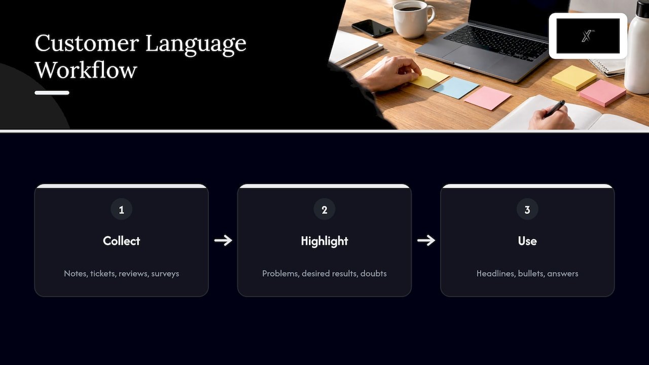
Open your sales call notes, support tickets, email replies, reviews and survey answers. Highlight phrases customers use to describe the problem, the result they wanted and the doubts they had. Those phrases become headlines, bullets and objection answers.
This is not a matter of taste. The best-known headline test in conversion work, reported by the Kirro blog, is said to have used wording mined from reviews. Whether or not you chase that kind of lift, the principle holds: customer language is more specific than company language.
Where it goes wrong: writing from your internal vocabulary. Words like “solution”, “platform” and “synergy” mean nothing to a stranger. “Cut your monthly reporting from two days to two hours” does.
Step 3: Write the offer in one plain sentence
Before drafting the page, write a sentence in this shape: “We help [specific audience] get [specific outcome] by [specific mechanism].” This is your value proposition: a specific, short statement of what is distinctly valuable about what you sell.
Test it by removing your company name. If a competitor could paste it onto their page unchanged, it is too vague.
Step 4: Draft the hero section
The hero is everything visible without scrolling: headline, subheadline, primary button and a supporting image or proof point. We cover formulas in the next section. Write ten headline options, not one. The first three are usually the obvious ones, and the better ideas arrive later.
Step 5: Build the body around benefits, then proof
Under the hero, answer the visitor’s next questions in order: how does it work, what do I get, why should I believe you, what if it does not suit me. Write each section heading as a benefit or an answer, so a visitor who only reads headings still follows the argument. Features support the benefit and do not replace it: “Automated follow-up emails” is a feature, “Never lose a lead because you forgot to reply” is the benefit.
Step 6: Add proof close to each claim
Place a testimonial, a number, a client logo or a short case result next to the claim it supports. We come back to this below.
Step 7: Finish with a single call to action and edit hard
Repeat the same action at the middle and bottom of the page. Then edit: cut every sentence that does not help the visitor decide, read the page aloud, and check it on a phone. If a section has no job, delete it.
Headlines and subheadlines that work
The headline should identify the offer and its most relevant outcome. The subheadline then adds one of four things: how it works, who it is for, the proof, or how easy it is. If the visitor reads nothing else, those two lines should still tell them whether they are in the right place.
Shopify’s guide says good copy tells readers within a few seconds of scrolling who you are, what you offer, why they should care and what to do next. Treat that as the specification for your hero.
Headline formulas you can adapt
These patterns are starting points. Fill them with specifics from your own customer research, then shorten them.
| Formula | Example shape | Best when |
|---|---|---|
| Outcome for audience with mechanism | “Fewer no-shows for dental clinics, with automatic text reminders” | The market is crowded and you need to stand apart |
| Stop the pain, start the outcome | “Stop chasing invoices. Start getting paid on time.” | The visitor already feels the problem |
| Number plus outcome | “Book 30% more demos in 60 days” | You have a result you can support with proof |
| Direct address | “Running a 10-person team on spreadsheets?” | The visitor will recognize their situation instantly |
| Question matching intent | “How do you launch a product in a new market?” | The visitor arrived from a search and wants an answer |
| Action plus product | “Launch your online store this week” | The visitor is ready to act and needs ease |
The subheadline can follow the pattern of naming exactly what you offer and adding a promise of ease, for example: “A full website, written, designed and built for you, live in six weeks.”
Making a formula credible
A formula gives you a shape. It does not give you a reason to be believed. Three habits keep headlines honest:
- Use numbers you can prove. Never publish a figure you cannot support. In the United States, the Federal Trade Commission treats deceptive claims as unlawful, and in Australia the Australian Consumer Law bars misleading or deceptive conduct in trade. If your headline promises a result, your records should back it.
- Name the audience. “For founders” is weaker than “for B2B software founders selling to mid-market teams.”
- Cut the adjectives. “Innovative, world-class, cutting-edge” tells the reader nothing. A specific noun and a specific number do.
If a headline becomes clumsy after you add the audience and the mechanism, drop the mechanism into the subheadline.
Write in plain language so the page can be scanned
People skim landing pages. They read the headline, glance at subheadings, look at the button and decide whether to dig in. Your copy has to survive that behavior.
Practical rules:
- Short sentences, short paragraphs, one idea each.
- Subheadings that state a benefit, not a label such as “Our process”.
- Bullets for lists of three or more items.
- Whitespace around the call to action.
- Plain words. If a ten-year-old would stumble on a term, replace it or explain it.
Plain does not mean simplistic. Experienced buyers also prefer copy that lets them understand the offer without effort. Technical detail belongs lower on the page, for the visitor who is already interested.
Benefits, proof and objections
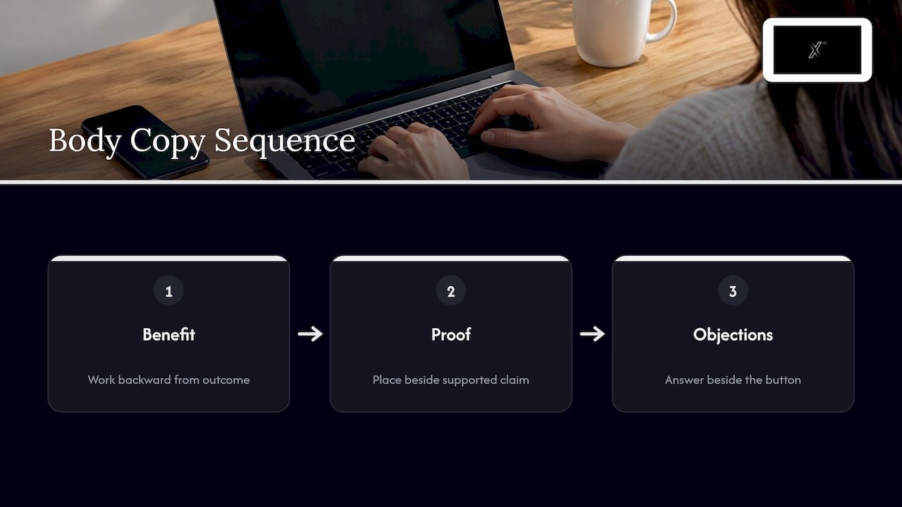
A benefit answers the question “what is in it for me?” Proof answers “why should I believe you?” Objection handling answers “what if it goes wrong?” Good body copy takes the visitor through those three in order.
Benefits. Start from the outcome the customer wants (more qualified leads, less admin, a brand that looks as serious as the business is) and work backward to the feature that delivers it.
Proof. Useful forms of proof include named testimonials, client logos, short case results with a real figure, review scores and certifications. Put each one next to the claim it supports. Use only real testimonials from real customers, with permission. The FTC has rules on how endorsements and reviews may be used in the United States, and fabricated or misleading reviews put a business at legal risk. You can see how we present client outcomes on our testimonials page and in our portfolio.
Objections. Think about what makes a visitor hesitate at the button: cost, effort, risk, time or fear of being stuck in a contract. Answer the likeliest one in a line of microcopy beside the button, such as “No credit card required” or “Get a reply within one business day”, but only if it is true.
The call to action
Every landing page should have one goal. That means one primary call to action, which may repeat in the middle and at the bottom of a long page, with all the copy building toward it.
The button label should describe the outcome the visitor gets. “Submit” and “Learn more” leave people unsure what happens next. “Get my quote”, “Book a 20-minute demo” or “Start my free trial” tell them. Keep it short, and start with a verb.
Support the button with a line that lowers the perceived risk, and make sure the form asks only for what you need. Each extra field is another reason to leave.
Landing page copy examples and what to learn from them
A case reported by MarketingSherpa shows how several copy and layout choices work together. Hubstaff, a B2B software company, redesigned its page with a shorter hero message, an email capture field built into the hero, testimonials and logos placed beneath the button, and imagery showing what users would receive. Conversion rose from 6.89% to 10.95%, a 59% lift, per the case study.
Three lessons carry over to your page:
- Say less, higher up. A succinct hero beats a crowded one.
- Put proof where the decision happens. Testimonials and logos sat directly under the button, not buried in a footer.
- Show the result. Imagery of what the visitor gets makes the benefit concrete.
A lift like that came from that company’s audience and offer. Use it as a pattern to test, not a promise for your page.
Here is how the same thinking changes a weak hero for a fictional small accounting firm:
- Before: “Welcome to Harbor Accounting. Trusted solutions for all your financial needs.”
- After: “Tax returns for freelancers, filed in 48 hours.” Subheadline: “Send us your documents once. We handle the filing and tell you what you owe.” Button: “Get my tax quote.”
The second version names the audience, the outcome, the ease and the action. It is an illustration, not a client result.
Short copy or long copy?
There is no universal word count. A simple offer with low commitment, such as a free checklist, usually needs little copy. A higher-priced or more complex offer, such as a rebrand, a custom app or a service contract, needs more explanation, proof and objection handling before a visitor will act. The test is not length but whether every section answers a question the visitor really has. Cut anything that does not. Add anything the visitor needs in order to say yes.
That is also why testing matters more than rules.
Test and improve without guessing
Your first draft is a well-informed guess. To improve it:
- Change one thing at a time, such as the headline, the button label or the proof placement, so you know what caused the result.
- Send enough traffic. A handful of visits proves nothing. Judge results by sample size and confidence, not by a single conversion rate.
- Run tests long enough to cover a normal business cycle, including weekdays and weekends.
- Read behavior as well as numbers. Session recordings and form drop-off show where people stop reading.
- Keep a log of what you tested and what you learned.
Copy is one part of the conversion picture. Page speed, layout, form design and tracking all matter, and the copy can only work when the experience around it supports it. For the design side, see our guide to conversion-focused web design and our practical guide to conversion rate optimization. For judging copy inside the wider page experience, including offer clarity, proof and signup flow, this piece on conversion-focused web design adds a useful angle.
A landing page copy checklist
Before you publish, check that:
- The headline states the offer and the outcome.
- The subheadline says how, for whom, or how easy.
- The page matches the ad, email or link that sent the visitor.
- Each section heading is a benefit or an answer.
- Claims are supported by real, nearby proof.
- There is one goal and one call to action, with an outcome-based label.
- The likeliest objection is answered next to the button.
- Every number and promise can be proven.
- The page reads well on a phone.
- Tracking is in place so you can measure the result.
Where Xpert Marketing fits in
Copy that converts depends on strategy, research, design, development and measurement working together. Xpert Marketing is a 360° agency that combines strategy, creative content production, digital marketing, web development and data and analytics under one roof, and it can act as your external marketing department when you need one. For a landing page, that means the message, the copy, the build and the tracking can be planned together instead of passed between separate suppliers.
If you want a page built to convert, look at our Web, Technologie & Innovation service and the full list of services. If you would rather build the skill in-house, we also offer digital marketing trainings.
For more on persuasive writing for business audiences, see our guide to persuasive copywriting techniques and our notes on designing landing pages.
Our view: copy is a business decision, not a finishing touch
Most landing pages we meet are built in the wrong order. The design comes first, the copy gets poured in at the end, and the analytics are added after launch, if at all. Then the page underperforms and everyone blames the headline.
We see landing pages as a connected system. Strategy decides who the page is for and what it promises. Research supplies the words. Creative and development give the words a clear, fast, trustworthy home. Analytics show what happened so the next version improves. When those pieces sit with one team, the message does not get lost between suppliers.
That is the idea behind how we work: strategy, creativity and execution in a single agency, measured by results the business can see. A landing page is a small project that shows the whole approach in miniature. If yours is not converting, start with the offer and the visitor, then look at the words.
Xpert
FAQ
How long should landing page copy be?
It should be as long as the visitor needs to say yes, and no longer. A free download needs little. A costly or complex service needs more explanation, proof and objection handling. Test a shorter and a longer version against your own audience rather than following a fixed word count.
What makes a good landing page headline?
A good headline names the offer and the outcome that matters most to the visitor, in plain and specific words. Name the audience if you can, and match the promise to the ad or link that brought the visitor. Write ten versions and keep the clearest.
Should a landing page have more than one call to action?
One goal and one type of call to action works best. You can repeat the same button in the middle and at the bottom of a long page, but avoid offering competing actions such as “Buy now”, “Download” and “Follow us” together.
Who should write landing page copy: me or an agency?
If you know your customers well and have time to research and test, you can write a solid first draft. If the page supports a campaign, a rebrand or a launch, it helps to have copy, design, development and analytics planned together, which is what our team does.
Sources
- Writing copy for landing pages, Stripe Atlas
- How To Write Landing Page Copy: 7 Tips, Shopify
- Conversion Optimization for B2B SaaS Companies, MarketingSherpa


