
Conversion-Focused Web Design: How to Build Pages That Turn Visitors Into Customers
Conversion-focused web design is the practice of building a website around the action you want visitors to take, whether that is a purchase, a demo request or a newsletter signup, and judging every design choice by whether it helps them take it. A conversion is simply that action, completed in response to a call to action (OptinMonster). Layout, color, text and images all work toward that single response. Below you will find the principles, the elements worth auditing, a method for finding where visitors drop off, and a way to test changes without guessing.
TL;DR
- A conversion-focused website is designed around one primary goal per page, and every element either supports that goal or gets removed.
- Conversion-centered design is the framework behind it: one focused action, persuasive structure, trust signals and less friction.
- Audit navigation, layout, calls to action, forms, trust signals and the mobile experience, in that order of impact on your goal.
- Find friction with analytics, session recordings and user feedback, then confirm fixes with controlled tests rather than opinion.
- Design for usability and accessibility first. A page people cannot use will not convert.
Sommaire
- What conversion-focused web design actually means
- Conversion-centered design: the framework behind the term
- Seven principles that guide visitors toward one action
- What to audit on your website
- How to find where visitors hit friction or leave
- How to test design changes
- A simple worked example
- Our perspective
- Work with a team that designs for results
- A short checklist to take away
- FAQ
- Sources
What conversion-focused web design actually means
A website is a tool for selling products or services, directly or indirectly. Baymard’s research on conversion design puts it plainly: the design should structure its elements around an overall goal, typically selling or getting visitors to sign up. That reframes the usual design brief. The question stops being “does this look modern?” and becomes “does this help a visitor finish what they came to do?”
The same source argues that conversion and usability should take priority over decoration. Graphic elements earn their place when they help visitors complete the desired goal, and they are cut when they do not. That does not mean ugly or stripped down. It means every visual decision has a job.
In practice, a conversion-focused site tends to share a few traits:
- Each page has one primary action, stated clearly.
- The headline tells visitors they are in the right place within seconds.
- Proof, such as reviews, client logos or case studies, appears near the moment of decision.
- Forms ask only for what you need.
- The experience works as well on a phone as on a desktop.
What counts as a conversion
Not every conversion is a sale. A conversion can be a purchase, an account signup, a newsletter subscription, a brochure download, a demo request or a video view. Leadpages recommends giving every page a primary conversion goal, even when that goal is only a step toward purchase. Their examples: a content opt-in on a blog page, a trial start on a features page, and a purchase on a pricing page.
This matters because many sites assign the same goal to every page, usually “contact us,” and then wonder why their blog posts do not convert. A blog reader is rarely ready to book a call. A relevant guide download is a more honest next step.
Conversion-centered design: the framework behind the term
If you searched for conversion-centered design, you are looking at the same idea from the framework side. It is a discipline for designing experiences around a single business goal, guiding visitors toward one specific action with persuasive design and psychological triggers. Landing pages sit at its heart because they use congruent design around one collective purpose, such as collecting information or moving a visitor to the next stage of the funnel.
The approach is not limited to landing pages. Shopify’s guide applies it to ecommerce pages and marketing content where the objective may be a purchase, a brochure download, a demo request or content sharing. And Webflow describes it as a mix of psychology-based techniques, user-centered methods and technical web design knowledge, all aimed at optimizing the user journey toward conversion.
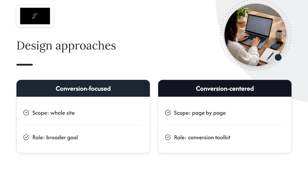
So the two terms are close cousins. Conversion-focused web design is the broader goal for a whole site. Conversion-centered design is the toolkit of principles you use to get there, page by page. If you want the landing page side in depth, our guide on designing landing pages that convert goes further.
Seven principles that guide visitors toward one action
Webflow lists seven principles: create focus, build structure, stay consistent, show benefits, draw attention, design for trust and reduce friction. Here is how each one plays out on a real page.
1. Create focus
Pick the one thing the page exists to do. Remove links and sections that point visitors somewhere else. A page with three equal goals usually delivers none of them well. If you cannot choose, the page probably needs to be split in two.
2. Build structure
Organize the page so the eye moves from the promise (headline) to the proof (benefits, evidence) to the action (button). Visual hierarchy, spacing and size tell visitors what to read first. Oli Gardner’s HubSpot piece describes this as clarity, relevance and urgency, with headlines, calls to action, layout, color and copy all pulling toward the next step.
3. Stay consistent
The ad, the email or the search result that brought the visitor should match the page they land on: same offer, same wording, same look. A mismatch makes people wonder if they clicked the wrong thing. Consistency also applies to your brand. Buttons, type and tone should feel like one company throughout.
4. Show benefits
Visitors care about what changes for them, not your feature list. Lead with the outcome, then support it with specifics. “Cut your reporting time” beats “Advanced dashboard module.”
5. Draw attention
Use contrast, whitespace and direction to make the primary button impossible to miss. The call to action should look clickable, say what happens next, and appear where the reader is persuaded, which is often more than once on a long page.
6. Design for trust
Add the reassurance people look for before committing: testimonials, client names, certifications, clear contact details, plain pricing or pricing guidance, and security cues near payment or form fields. Mailchimp’s list of conversion-centered tips includes trust signals and feedback mechanisms alongside clear purpose, user research, simple forms and benefit-led content.
7. Reduce friction
Friction is anything that makes the action harder than it needs to be: long forms, unclear labels, slow pages, surprise steps, confusing navigation. Removing it is often the cheapest improvement available.
What to audit on your website
Principles are useful, but you need to apply them to specific parts of the site. Work through these in turn, and for each one ask the same question: does this help the visitor reach the page’s goal?
| Element | What to check | Common problem |
|---|---|---|
| Navigation | Can a first-time visitor find the main path in a few seconds? Are there too many menu items competing for attention? | Menus built around internal departments instead of visitor tasks |
| Page layout | Does the headline, proof and button sequence make sense on scroll? | Key message buried under a decorative hero image |
| Calls to action | Is there one clear primary action? Does the label say what happens next? | Vague buttons such as “Submit” or several equal-weight buttons |
| Forms | Does every field earn its place? Are errors explained clearly? | Asking for information you do not use |
| Trust signals | Are reviews, logos, case studies and contact details near the decision point? | Proof hidden on a separate page nobody visits |
| Mobile experience | Can a thumb reach the button? Is text readable without zooming? | Desktop layouts squeezed onto small screens |
| Page speed | Does the page load quickly on an average phone connection? | Heavy images and scripts nobody needs |
Treat this as a prioritization list, not a to-do list to finish in a week. Start with the pages closest to revenue: the homepage, your main service or product pages, pricing, and the checkout or contact page.
Navigation and layout
Good navigation answers three questions: where am I, where can I go, and what should I do next. Keep the top-level menu short, use words visitors would use themselves, and make the primary action available from the header. On landing pages, many teams remove the main navigation entirely so there is nowhere to wander off to, which follows the focus principle directly.
Calls to action and forms
Write buttons as a promise: “Get my quote,” “Book a strategy call,” “Download the checklist.” Make the button stand out through contrast against the page, not just through size. For forms, cut every field you cannot justify. If sales needs a phone number but most visitors hesitate to give one, consider whether it should be optional on the first step.
Trust and mobile
Place proof next to the ask. A testimonial three screens away from the button does little. On mobile, check real devices rather than a resized desktop browser: tap targets, sticky buttons, form keyboards and load time all behave differently.
Accessibility is part of conversion
Accessibility and conversion are not in tension. Clear contrast, readable text, labeled form fields and keyboard-friendly navigation make a page easier for everyone, including the people with disabilities who are part of your market. Baymard’s guidance to remove elements that do not improve usability fits here: if a flourish makes a form harder to read or operate, it is costing you conversions. Brand consistency works the same way. Your brand colors and typography can stay, but they should be applied so the button and the text remain legible.
How to find where visitors hit friction or leave
Opinions about what is wrong with a site are cheap and often wrong. Use evidence.
- Define the conversions first. Set up tracking for each goal: form submissions, purchases, calls, downloads. Without this, nothing else is measurable.
- Look at the funnel in your analytics. Compare page by page: where do visitors enter, where do they exit, and where does the drop between steps look unusually large? Segment by device and traffic source, since a page that converts on desktop may fail on mobile.
- Watch real sessions. Session recordings and heatmaps show hesitation, rage clicks, ignored buttons and forms abandoned at a particular field.
- Ask visitors. A one-question exit survey or a short feedback prompt on key pages surfaces reasons that numbers cannot. Mailchimp’s guidance includes feedback mechanisms for this reason.
- Test the journey yourself. Complete the main conversion on a phone, on a slow connection, as someone who has never seen your site. Note every moment of doubt.
- Write down hypotheses. For each problem, state what you will change and why you expect it to help.
If you want a deeper walkthrough of the measurement side, our practical guide to conversion rate optimization covers it in detail.
How to test design changes
Once you have a hypothesis, test it. A/B testing, where half of your visitors see the current version and half see a variation, is the standard method. Unbounce’s guide lists A/B testing alongside CTA design, copywriting and mobile conversion as core topics for conversion-centered work. Gardner’s view is that effective conversion-centered design balances creative design with analytical testing and continual optimization.
A few habits keep testing honest:
- Change one meaningful thing at a time, or you will not know what caused the result.
- Let the test run long enough to cover full weekly cycles and collect enough conversions to mean something. Low-traffic sites may be better served by bigger, bolder changes and before-and-after comparisons than by fine-grained tests.
- Decide the success metric in advance, ideally the real business outcome (qualified leads, revenue) rather than clicks alone.
- Record what you learned, including the losers. A failed test still tells you something about your audience.
A simple worked example
Imagine a services company whose homepage has five different buttons: “Learn more,” “Contact,” “Our work,” “Blog” and “Newsletter.” Traffic is decent but few enquiries arrive.
Applying the principles, the team picks one primary goal for the homepage: a booked discovery call. The hero gets a headline stating who the company helps and with what, a single button reading “Book a discovery call,” and two client logos beneath it. The services section is rewritten around results. A short case study sits directly above a second call to action. The enquiry form drops from eight fields to four. On mobile, the button sticks to the bottom of the screen.
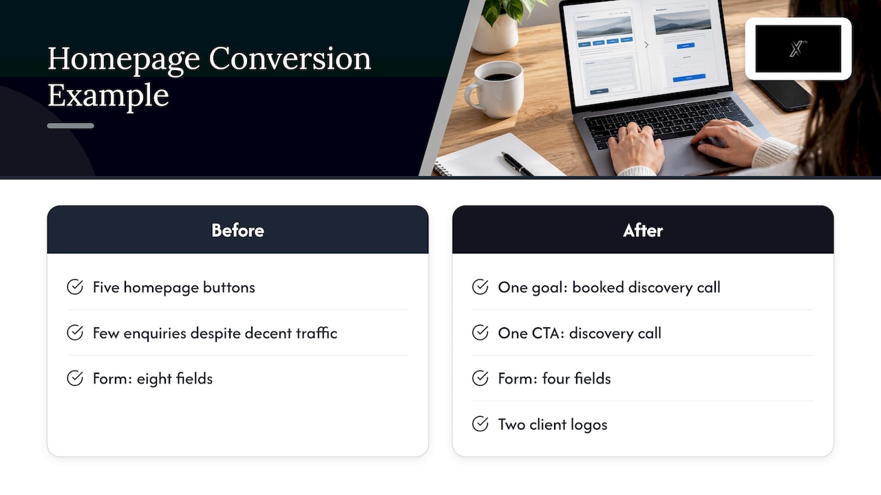
None of that is a redesign in the visual sense. It is a restructuring around one decision, and the team would then test the headline and form length one at a time. Treat this as an illustration of the method, not a promised result.
Our perspective
We see the same pattern again and again: companies treat the website, the ads and the content as separate projects, then wonder why visitors do not convert. A site that converts is a connected system. The message that earns the click, the page that receives it and the follow-up that nurtures it all have to agree.
That is why we approach web design as part of marketing, not apart from it. Strategy decides who the page speaks to and what it asks of them. Creative makes the message clear and memorable. Development makes it fast and usable on every device. Analytics shows what is working so the next decision is based on evidence, not taste.
Keeping those disciplines under one roof is what we offer, and it is why we can act as an external marketing department when a business needs one. A design team working alone can make a page beautiful. A team that also understands traffic, content and measurement can make it perform.
Xpert
Work with a team that designs for results
If your website looks fine but does not produce enough enquiries or sales, the fix usually spans more than design: positioning, messaging, page structure, tracking and the traffic feeding it. Our web, tech and innovation services cover UX/UI, landing pages, e-commerce and WordPress, and our data and analytics team helps you measure what happens after launch. Read more about why a website should work like a sales system, or see everything we do on our services page.
To discuss your site, start from our main page and tell us what you want visitors to do.
A short checklist to take away
- Every page has one stated primary goal.
- The headline says who the page is for and what they get.
- One primary button, with a label that describes what happens next.
- Proof sits beside the call to action.
- Forms contain only necessary fields.
- Navigation is short and uses visitors’ own words.
- The page works on a real phone, loads quickly and is readable by everyone.
- Conversions are tracked, and changes are tested before they are rolled out.
FAQ
What is a conversion-focused website?
It is a website built to get visitors to take a specific action, such as buying, signing up or requesting a demo. Layout, color, copy and images are chosen to support that action instead of simply looking attractive. Each page has a clear primary goal.
What is conversion-centered design?
It is a framework for designing an experience around a single business goal, using persuasive design techniques and attention to user psychology. Landing pages are its best-known application, but the principles of focus, structure, trust and reduced friction apply across a whole site.
What is conversion in web design?
A conversion is any completed action that matters to your business: a purchase, a form submission, a subscription, a download or a booked call. Conversion rate is the share of visitors who complete it. Defining which actions count is the first step in designing for them.
Does conversion-focused design make a site less attractive?
No. It changes the standard from decoration to purpose. Visual elements stay when they help visitors reach the goal and go when they do not. Done well, the result is cleaner and more distinctive, because the brand shows up in a design that is easy to use.
Sources
- What Is Conversion-Focused Web Design (+ Tips & Examples)
- Conversion Design: the Real Purpose of Web Design, Baymard
- Conversion-Centered Design guide (PDF), Unbounce
- Conversion-Centered Design Explained and How To Apply It, Shopify
- Conversion-centered design: 7 essential principles, Webflow
- The 7 Principles of Conversion-Centered Landing Page Design, HubSpot
- Tips for Successful Conversion-Centered Design, Mailchimp
- Building a Conversion-Optimized Website, Leadpages


