
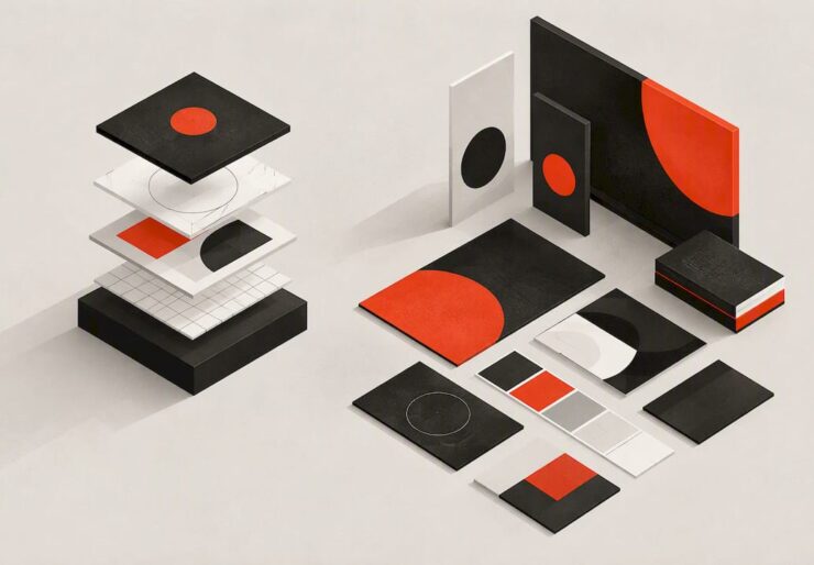
Visual Identity Design: Elements, Process and Guidelines
Visual identity design is the work of turning what your business stands for into a consistent set of visual elements: logo, color, typography, imagery and graphics, plus the rules for using them. Done well, it lets customers recognize you at a glance and feel something specific about you before they read a word. This guide covers what a visual identity includes, how it differs from brand and corporate identity, how to build one step by step, and what to put in the guidelines so the system survives growth.
TL;DR
- A visual identity is a system, not a logo: color palette, typography, logo, imagery and graphics, plus a style guide that sets the rules.
- Brand identity is broader (voice, messaging, personality). Corporate identity is broader still, covering behavior and environments.
- Build it in order: strategy and research, direction, core elements, application tests, then guidelines and templates.
- Guidelines should show exact color codes, logo rules and, just as important, what not to do.
- Scale comes from templates and a single shared home for approved assets, not from policing every designer.
Indice
- What visual identity design actually covers
- Visual identity vs. brand identity vs. corporate identity
- The core elements of a visual identity system
- How to design a visual identity, step by step
- What visual identity guidelines should include
- Making the system scale across channels
- What to learn from strong visual identities
- Our perspective
- Work with an agency that carries the identity through
- FAQ
- Fonti
What visual identity design actually covers
A visual identity is the collection of visual elements that act as a brand’s face. Adobe’s design guide describes these elements as communicating a company’s identity, values and purpose at a glance, which supports instant recognition and emotional connection.
That “at a glance” part is the commercial point. Your website, a LinkedIn ad, a proposal PDF, a trade show banner and a delivery box each get a second or two of attention. A coherent identity means all of them read as the same company, so every touchpoint builds on the last instead of starting over.
The idea is not new. Academic work on organizational identity traces it back to Pilditch (1970), who argued that the impression an organization gives verbally must match the one it gives visually, and both must correspond to the reality of the organization, as discussed in a 2024 Taylor & Francis article on visual identity authenticity. The practical lesson: a beautiful identity that overpromises is a liability. The design should express what you really are, or what you are credibly becoming.
Visual identity vs. brand identity vs. corporate identity
These three terms get used interchangeably, which causes scoping problems when you brief an agency. A clean way to separate them:
| Term | What it covers | Typical question it answers |
|---|---|---|
| Visual identity | Logo, color, typography, imagery, graphics and usage rules | How do we look? |
| Identità di marca | Visuals plus voice, tone, messaging and personality | How do we look and sound, and what do people feel? |
| Corporate identity | Aesthetics, actions and behaviors toward internal and external stakeholders | Who are we as an organization? |
Shopify’s guide to corporate identity frames corporate identity as a company’s aesthetics, actions and behaviors as they relate to employees, customers and other stakeholders, with brand identity as a narrower subset focused on customer perceptions, including visuals and messaging.
Academic literature pushes the boundary even further. A Brunel University paper notes that corporate heritage design can involve sound, scent, touch, vision and taste, and corporate brand design also includes architecture and corporate environments. Balmer and Gray (2003) argue that corporate identity is the source and essence of what an organization is, so it should be the foundation for all visual identity and communication, as reviewed in a Brunel University chapter on identity studies.
Brand identity vs. logo
A logo is one asset inside the system. It matters a great deal, and Canva’s style guide advice is to use it consistently in every asset that represents the company. But a logo alone cannot carry a brand. It does not tell a designer which colors to use on a slide, how to crop a photo or what a social post should feel like. That is the job of the wider system.
If you are considering changing only the mark, our piece on when to redesign a logo and how to do it well walks through the decision.
The core elements of a visual identity system
The building blocks are consistent across most credible sources: color palette, typography, logo, imagery and graphics, held together by a style guide with rules and templates for how the brand should look across channels and mediums. Here is how we think about each in practice.
Logo and logo system
Olins (2008) argues that a corporate brand logo should capture the essence of the brand with brevity and immediacy, while the wider visual style should be alluring and differentiating, per the Brunel University paper on corporate brand design. In practice, that means designing a logo family rather than a single file: a primary version, a compact version for avatars and app icons, a one-color version, and a reversed version for dark backgrounds.
Color
A palette is more than three pretty swatches. Define a primary color, one or two secondary colors, neutrals, and functional colors for states such as success or error if you have a digital product. Record each in the formats your team will actually need: hex and RGB for screens, CMYK for print.

Typography
Pick a typeface pairing with a clear hierarchy: one for headlines, one for body text, and fallbacks that exist on every operating system. Specify sizes and weights for common uses such as web headings, presentation titles and email body copy.
Imagery and graphics
This is where most identities drift. State what your photography looks like (real customers or stylized studio shots, natural or controlled light), what illustration or iconography style you use, and how patterns, shapes and data visualizations should look. A good test: could someone who has never met your team pick the right image from a stock library?
Layout and motion
Grids, spacing and animation rules turn separate elements into a recognizable look. Even a small set of layout principles, such as how much white space surrounds a logo, makes materials from different people feel related.

How to design a visual identity, step by step
Agencies vary in their sequence, but a sound brand identity design process follows the same logic: understand, decide, design, test, document.
- Align the identity with your mission and vision. Shopify’s advice on corporate identity starts with aligning it to the company’s mission and vision and doing market research on changing audience needs. Write down who you serve, what you promise and what makes you different before anyone opens a design tool.
- Audit what exists. Collect every current asset: decks, packaging, web pages, social profiles. Note which parts are working and which contradict each other.
- Research the field. Look at how customers and competitors present themselves. The aim is to find visual territory that is both appropriate for your category and recognizably yours.
- Define the direction. Turn strategy into two or three visual territories, with mood boards and a few sample applications each. Choose one and refine it.
- Design the core elements. Logo system, palette, type, imagery and graphic language, developed together so they support each other.
- Stress-test in real applications. Place the identity on a homepage, a social ad, an invoice, a slide template, signage and a small mobile screen. Fix what breaks. Check whether the elements reflect the brand’s personality, not just whether they look good.
- Document and roll out. Build the guidelines and templates, train the team and plan the migration of existing assets.
This is also where verbal identity joins in. If your visuals are polished but your messaging is inconsistent, customers notice. Our article on brand voice guidelines and how to roll them out covers that half of the system.
What visual identity guidelines should include
Guidelines are the difference between an identity that exists in a designer’s folder and one that shows up correctly everywhere. Per HubSpot’s brand style guide resource, a solid document sets standards for logos, color palettes with exact CMYK and hex codes, typography, imagery, and rules for how these elements should and should not be used, giving teams a single source of truth.
A practical table of contents:
- Brand foundation: mission, positioning and personality in a page or less, so designers understand the intent.
- Logo: versions, minimum sizes, clear space, placement and approved backgrounds.
- Color: primary, secondary and neutral palettes with codes, plus accessible text and background pairings.
- Typography: typefaces, hierarchy, sizes, line spacing and web fallbacks.
- Imagery and graphics: photography direction, illustration, icons, patterns, charts.
- Voice and tone: a short section or link to your messaging guidelines.
- Applications: worked examples for web, social, presentations, print, packaging and signage.
- Misuse: a visual gallery of what not to do.
That last item is underrated. Canva’s guidance stresses defining forbidden uses of brand elements, such as stretching or recoloring a logo, so that well-meaning designers do not weaken the brand. A single page of “don’ts” with pictures prevents more errors than ten pages of rules.
Keep the document usable. If your guidelines run to 80 pages and nobody opens them, they have failed. Lead with a two-page quick reference and link to detail for specialists.
Making the system scale across channels
A identity that works on a homepage but falls apart in a partner’s slide deck is not finished. HubSpot’s guidance points to a repeatable approach: put brand guidelines into responsive templates and distribute approved assets from centralized digital tools, so stakeholders can quickly produce on-brand materials without asking the design team each time.
For teams that work in design software, Figma’s tooling lets designers connect existing libraries and tokens to generate editable, collaborative guidelines that stay aligned with the design system. The principle holds whatever tools you use: the guideline, the templates and the working files should come from the same source, so they do not drift apart.
Practical steps that make a system scale:
- Build templates for the 10 formats you produce most: slide decks, social posts, email, proposals, one-pagers, web banners and so on.
- Store assets in one place with version control and clear naming, so nobody emails old logos around.
- Design a core and a flex. The core never changes (logo, main colors, type). The flex (illustration, photography, seasonal graphics) can evolve without a full rebrand.
- Assign an owner. Someone needs authority to approve exceptions and update the guide.
- Review annually. Platforms, formats and audience habits shift, and so do the demands on a visual system.
If your website is a major touchpoint, build the identity into your design components from the start. Our Branding & Visual Identity service connects identity work to web, content and campaign execution so the system is applied, not just delivered.
What to learn from strong visual identities
You do not need a famous brand’s budget to borrow its habits. When you study well-known identities, look past the logo and ask four questions:
- Is there one recognizable idea? Strong systems usually have a clear organizing device, such as a distinctive color, a shape, a type style or a photographic approach, that repeats everywhere.
- Does it flex without breaking? Check the brand’s website, app icon, ads and packaging side by side. The best systems look related but not identical.
- Does it fit the category and still stand out? A law firm and a children’s app should not look alike, yet each needs a feature that competitors lack.
- Does it match the company’s behavior? The visual promise should be backed by service, product and tone.
A useful exercise is to take three brands you admire, screenshot five touchpoints each and mark the elements that repeat. You will usually find that the consistency comes from three or four decisions applied relentlessly, not from dozens of clever details.
Our perspective
We see the same pattern in most rebrands that disappoint: the identity was designed as a deliverable, and then nobody owned it.
A logo and a PDF do not change how a company shows up. What changes it is a system that connects strategy, creative and execution, so the people building the website, the campaigns, the sales decks and the events all work from the same decisions.
That is why we treat visual identity as one part of a connected marketing system. We start from market research and the business goal, design the elements, then carry them into content, digital channels and web builds, and we can act as an external marketing department so the identity is applied consistently after launch.
If your identity feels inconsistent, the fix is rarely a bigger design budget. It is usually clearer decisions, better templates and someone accountable for using them.
Xpert
Work with an agency that carries the identity through
If you are rebranding, launching a startup or consolidating a patchwork of materials, we can help with the full chain: strategy, identity design, guidelines, content production, web and campaigns. You can see the full range on our services page.
We do not publish fixed prices for identity projects because scope varies with the size of the company and the number of touchpoints. Contact us through our site to talk through your situation. You can also read how we think about building brands that scale and review past work in our portfolio.
FAQ
What is the difference between visual identity and brand identity?
Visual identity is what people see: logo, color, typography, imagery and graphics. Brand identity includes all of that plus voice, tone, messaging and personality. Think of visual identity as the visible layer of a larger brand system.
How long does it take to design a visual identity?
It depends on the size of the business and how many touchpoints need templates. A focused identity for a small company can take several weeks, while a multi-brand organization needs longer for research, testing and rollout. Ask any agency for a timeline split by phase before you sign.
What should be in a brand style guide?
Include logo versions and rules, color codes in hex and CMYK, typography, imagery direction, voice and tone, application examples and a gallery of misuse. HubSpot’s resource on brand style guides lists the same core items. Keep a short quick-reference version for everyday use.
How much does visual identity design cost?
Costs depend on scope: research depth, number of logo versions, templates and rollout support. We break down the factors by company size in our guide to visual identity pricing.
When should a company update its visual identity?
Consider it when the business has changed direction, when materials look inconsistent across channels, or when the identity no longer fits your audience. Often a refresh of the system is enough, without replacing the logo entirely.
Fonti
- Visual Identity Design Guide, Adobe
- The Authenticity of Organizational-Level Visual Identity, Taylor & Francis
- Corporate Identity Design: 2026 Guide, Shopify
- Visual Identity: Definition, Examples, and Tips, Shopify
- Design, Corporate Brand Design and Corporate Heritage Brand, Brunel University
- A review of identity, Brunel University
- How to create a brand style guide, Canva
- How to Create Effective Brand Guidelines, HubSpot
- AI Brand Guidelines Generator for Designers, Figma


